Symbols of Power in Plain Sight: Tradition, Branding, or Hidden Meaning?
Some modern logos and older ritual emblems are not merely vaguely similar: they share strikingly close silhouettes or internal geometry. What can be historically verified, what remains a hypothesis of deliberate esoteric borrowing, and what can presently be neither confirmed nor excluded?
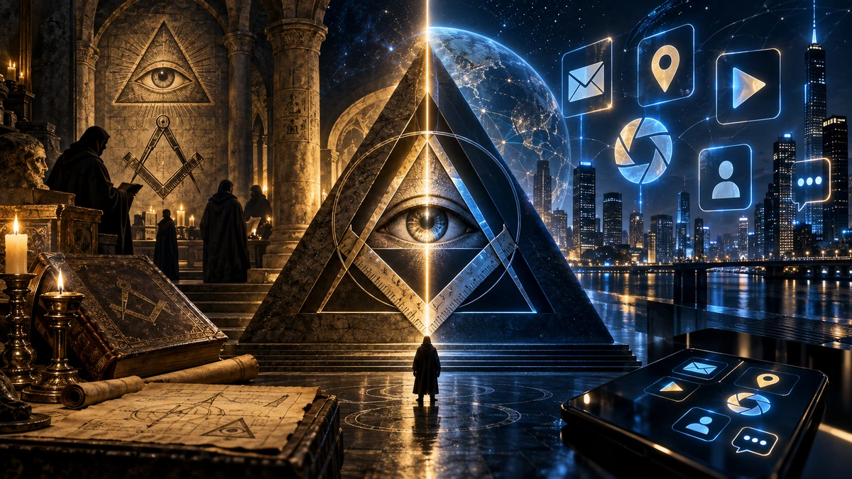
Online comparison collages place the App Store, Gmail, Chrome, Google Play, Google Maps, Android or Facebook beside Masonic, religious or esoteric emblems. In some pairings the resemblance is not merely a generic circle or triangle: silhouette, line ratios or internal geometry are close enough that the comparison deserves to be treated seriously as a visual fact.
A visual fact, however, is not yet a historical explanation. The same mark can have a publicly documented design rationale while also carrying an additional reference for which no documentation survives or has been found. An official explanation therefore establishes at least one layer of intent; by itself it does not prove that no second layer existed. The reverse is equally important: even a near-identical structure is a reason to investigate, not automatic proof of a common organisation or hidden cult.
This article therefore applies a symmetrical evidentiary rule. Resemblance will not be used to prove secret affiliation, but neither will secret affiliation be dismissed merely because a public logo explanation exists. Where an older symbol is historically documented, its tradition is explained. Where a modern brand has explained its mark, that explanation is recorded. Where the transmission chain is missing, the proposed connection remains an open hypothesis.
This matters especially for the theory that parts of modern visual culture deliberately borrow from Masonic, Hermetic, religious or other initiatory traditions. Such a possibility is in principle testable, but it requires an archive, sketch, designer testimony, internal document or another trace. Until such a trace is found, the most accurate answer is often: the resemblance is real, the older symbol can be explained, and the cause of the resemblance remains open.
A symbol is not just a shape: five layers that must be separated
Symbol comparisons benefit from separating five different questions. First is morphology: are the two marks genuinely similar? Second is historical semantics: what did the older emblem mean within its own tradition? Third is documented modern intent: how did the company or designer publicly explain the modern mark? Fourth is the transmission hypothesis: was the older symbol deliberately used as an additional reference? Fifth is the hypothesis of independent convergence or later interpretation.
The first three layers can often be checked directly. The fourth and fifth are causal explanations. Here the evidentiary standard must be symmetrical. It is not sound to say “they look alike, therefore a secret connection is proven”; but it is equally unsound to say “the designer gave a functional explanation, therefore an additional symbolic layer was impossible.” Public and concealed meanings are not logically mutually exclusive.
This article therefore does not reduce resemblance to coincidence, but it also does not convert resemblance into proof of affiliation. Where structures are unusually close, this is recorded as a strong visual resemblance. The next question is whether a transmission trace exists. If it does not, at least two explanations remain open: independent design convergence or deliberate but undocumented symbolic borrowing.
The eye and the pyramid: documented symbolism, an open transmission question
The eye as a symbol has a long history, but the Egyptian Eye of Horus and the European Eye of Providence are not simply the same thing. The Egyptian wedjat is tied to the myth of Horus, restoration of the injured eye, protection, healing and completeness. The European Eye of Providence developed in Christian visual culture and was associated with divine providence, omniscience and, often, the triangle as a Trinitarian form. The resemblance — an isolated eye — is obvious; a direct historical equation requires more than appearance.
The reverse of the Great Seal of the United States contains an unfinished pyramid with an eye above it. The official 1782 history preserves Charles Thomson’s explanation: the pyramid signifies strength and duration, while the eye and motto refer to the ‘interpositions of providence’ in favour of the American cause. That is documented intent for a specific state emblem, so no secret explanation is required to establish what its designer said the device meant.
Masonic sources confirm that the all-seeing eye genuinely belongs to Masonic symbolic history, while the eye-and-pyramid combination is not presented as a single official emblem of Freemasonry as a whole. Other symbols, including the Owl of Minerva, are documented for the historical Bavarian Illuminati. This chronology means that “eye + pyramid = proof of Illuminati authorship” cannot be established from the image alone. It does not, however, close the broader question of esoteric influence: that would require an additional historical trace connecting specific actors, ideas and design choices.

When a symbol of power really is a symbol of power
Caution about hidden meanings does not require us to underestimate open symbolic power. The Great Seal was created so that the state could be visually recognisable on official documents. Coats of arms, flags, seals, insignia and uniforms are not random decoration: they are part of an institutional language that communicates identity, continuity, jurisdiction and legitimacy.
The corporate world uses the same basic logic for different ends. Meta explicitly treats the Facebook mark as a core brand asset, while Google tightly specifies the use of product icons and colours. This is intentional management of symbols. Such public documentation tells us what a company wants the mark to do; by itself it cannot prove that no additional cultural or symbolic references were present during design.
Consumer research also shows that logo geometry can influence brand judgments. Experiments have linked circular and angular logos with different impressions of softness, hardness, psychological distance or premiumness. The symbolic power of a logo is therefore real without any hidden code: shape can organise associations, and a brand can reinforce those associations through repeated exposure.
The App Store and the compasses: a documented explanation does not close the resemblance question
The older App Store mark is one of the strongest comparisons in such collages because its basic structure — two diagonal strokes and a cross-stroke inside a circular field — is visually close to compositions built from the Masonic square and compasses. Masonic sources unequivocally document the square and compasses as a central emblem of the tradition, so the comparison is not based on an invented older symbol.
At the same time, the App Store trademark has a formal description: the A is made from a ruler, pencil and paintbrush. That is important evidence for the mark’s constituent elements and public functional meaning — tools used to create applications. Yet the description explains what the strokes represent; it does not necessarily establish why that exact arrangement was selected or prove that the designer had no knowledge of similar older iconography.
The article therefore does not force one explanation. The visual resemblance is strong and verifiable. The public meaning is also documented. Deliberate Masonic reference remains unconfirmed, but it is not logically excluded by the public explanation alone. Moving from hypothesis to historical claim would require a sketch, designer testimony, internal documentation or another trace of transmission.
Gmail and the Royal Arch: an envelope, an M and a striking compositional proximity
Google itself called the older Gmail mark the “m-velope”: an envelope whose borders form the letter M. That development path is well documented. Yet viral collages often do not compare Gmail with an arbitrary red chevron; they compare it with Royal Arch Masonry regalia — a white apron with red edging and a geometric emblem on the flap.
Historical Royal Arch literature confirms that a nineteenth-century apron was prescribed with scarlet edging and a triple tau within a triangle and circle on the flap. This does not make Gmail a copy of that apron. It does mean that the older comparison object is real and historically documented, so the resemblance cannot simply be dismissed as an invented internet symbol.
What is presently missing is the bridge between the two. Google documents the envelope and M; Masonic literature documents Royal Arch regalia. No design document has been found that directly links them. Independent compositional convergence and deliberate symbolic allusion therefore both remain open possibilities, and the article does not choose between them without an additional source.
Chrome, Google Play and Maps: public function and additional symbolic readings
For Chrome we have direct design explanations concerning Google colours, circular composition, clickability and later simplification. At the same time, an online interpretation has long circulated in which the three curved or spiral-like segments can be read as three sixes — 666. That geometric reading can be drawn and checked against the form itself; the unresolved question is whether it was intentional.
Source discipline matters here. Labels such as “Divine King Sign / 666,” found in some collages, could not be reliably identified in the historical corpus examined as a standardised old ritual emblem. We can therefore verify the existence of a 666 reading of the Chrome geometry, but not the genealogy of the specific comparison sign or the intent of Google’s designers. Nor is intent declared impossible; it is simply marked unproven.
The same distinction applies to Google Play and Maps. Google Play has a documented functional explanation for the triangle as a play button, yet the triangle is also an ancient symbolic carrier that can represent a pyramid, an element or hierarchy in other traditions. The Maps pin is functionally documented as a precise location marker, but in some stylisations its circular centre and outer contour genuinely produce an eye-like composition. Functional origin and additional symbolic association are therefore not mutually exclusive.
Android and Facebook: the viral collage itself must also be source-audited
With Android, the first question is which mark we are actually looking at. Designer Irina Blok documents the origin of the green Android robot, but the blue icon with a white compass-like figure circulated in some collages as “Android Product Store” is not the same as the well-documented classic Android Market or Google Play identity. Its exact provenance therefore remains open in this article and it is not treated as firm evidence.
For Facebook, the official development of the f mark is well documented. Some collages compare it with a sign attributed to the Masonic motif Tubal-Cain. Tubal-Cain does have a real place in Masonic literature, but the exact graphic form used in the viral collage has weaker provenance than, for example, the square-and-compasses or the Royal Arch triple tau. The comparison is therefore presented as a theory, not as an already established historical identity.
These examples are methodologically important. A collage can be visually suggestive, but each left-hand and right-hand object must first pass its own provenance check. When both the older symbol and modern logo are authentic, geometry can be compared. When the label or provenance of one side is uncertain, that uncertainty is preserved — not to reject the theory, but to avoid giving it more evidence than is actually available.
When the resemblance is too precise to simply wave away
Simple forms do recur independently: circles, crosses, triangles and letters have a limited number of useful compositions. But that general fact does not make every specific resemblance unimportant. When multiple elements align at once — outer silhouette, internal diagonals, relative positions and construction logic — it is reasonable to ask whether we are seeing convergence or genuine cultural transmission.
Deliberate symbolic borrowing is ordinary in the history of art, religion and heraldry. Symbols move between institutions, acquire new meanings, are simplified and adapted to new media. The hypothesis that a modern designer or commissioner might deliberately employ an older esoteric form is therefore methodologically legitimate. It remains unproven only until a trace of the specific transmission is found.
The article therefore does not use “it is only geometry” as a final answer. Geometry explains why independent emergence is possible; it does not tell us what happened in a specific design process. Where resemblance is unusually strong, it is described plainly and without ridicule — followed by an equally plain statement about whether a historical link is documented.
Two competing explanations: projection or deliberate allusion?
When a transmission document is missing, at least two serious possibilities remain. The first is retrospective pattern recognition: an observer sees an older symbol in a new form even though the designer did not intend the connection. Psychological research does show that humans rapidly detect structures, faces and associations in ambiguous material. That can explain how a compelling resemblance is perceived.
The second possibility is deliberate but publicly unexplained allusion. This is historically plausible as well: creators routinely use references, homage, layered signs and in-jokes that never appear in official brand descriptions. Without a document, we cannot know which explanation applies in a particular case.
The article therefore does not use perceptual psychology as a diagnosis or as an argument against symbolic theories. It is treated only as one possible explanation, alongside the theory of deliberate esoteric borrowing. Choosing between them requires historical evidence, not a preference for whichever explanation feels more intuitive.
Evidence matrix: what can be confirmed and what remains open?
| Case | Confirmed | Open / unconfirmed |
|---|---|---|
| Eye of Providence and U.S. Great Seal | The 1782 seal has a documented Providence explanation; pyramid and eye are intentional elements | Whether additional esoteric or Masonic influences affected the specific design beyond what the official record states |
| Square & Compasses / App Store | The Masonic square-and-compasses is an authentic central emblem; the App Store A is officially described as ruler, pencil and paintbrush | Whether the unusually similar composition is independent or a deliberate symbolic allusion |
| Royal Arch / Gmail | Royal Arch aprons with a triple tau within triangle/circle are historically documented; Gmail’s “m-velope” is documented | Whether the compositional resemblance is deliberate borrowing or convergence |
| Chrome / 666 | Chrome design genealogy is documented; a three-sixes geometric reading can be drawn on the form | Whether 666 was intended; the provenance of the “Divine King Sign” label in the viral collage is unverified |
| Google Play / triangle-pyramid | Google Play uses a documented play triangle | Whether a deliberate pyramidal/esoteric reference exists in addition to the functional meaning |
| Google Maps / eye | The pin has a documented functional origin; some stylisations produce an eye-like composition | Whether resemblance to the Eye of Providence is intended or retrospective association |
| Android “Product Store” collage | The viral comparison motif exists | The exact provenance of the blue icon and its connection to official Android/Google design |
| Facebook / Tubal-Cain comparison | The Facebook f and its development are documented; Tubal-Cain is a real motif in Masonic tradition | The provenance of the exact Tubal-Cain graphic used in the collage and any connection to Facebook |
| Symbolic theory in general | Older traditions and modern brands both use intentional symbolism; design affects recognition and association | Whether any specific resemblance represents deliberate transmission, independent convergence or later interpretation |
The matrix deliberately has no “debunked” column. In most cases we have enough evidence to establish the older symbol, the modern logo and the degree of visual resemblance, but not a document that decides the cause of the resemblance. The most accurate status for many pairings is therefore open / unconfirmed, not “proven” and not “disproved.”
An open question should remain open
After verification, several firm points remain. The older symbols are real, their meanings are often well documented, and some modern marks are structurally very close to them. At the same time, many modern logos have a publicly explained functional or branding genealogy. Both facts can coexist.
What is missing in most cases is the decisive trace showing whether resemblance emerged independently or through deliberate borrowing from Masonic, Hermetic, religious or other esoteric traditions. Such borrowing is therefore not confirmed, but neither will it be declared excluded without evidence that warrants exclusion. Likewise, coincidence or psychological projection will not be presented as a proven explanation merely because they are more ordinary possibilities.
The article therefore ends where the real research begins: how many of these resemblances have a traceable genealogy, how many are deliberate but undocumented, and how many arose independently? Until an archive or testimony is found, the most accurate formulation is that some symbols are strikingly close; theories of hidden symbolic continuity can be described and tested; and the article will not claim more about what lay behind a particular logo than the sources allow.
Sources and further reading
- U.S. Department of State, National Museum of American Diplomacy — “The Great Seal” — official history of the 1782 seal and Charles Thomson’s explanation of its symbols.
- U.S. Department of State — The Great Seal of the United States (official historical booklet) — reverse design, pyramid and Eye of Providence.
- Scottish Rite of Freemasonry, Southern Jurisdiction — “Is the ‘eye in the pyramid’ a Masonic symbol?” — distinguishes the Great Seal from official Masonic emblems.
- Scottish Rite, Northern Masonic Jurisdiction — “The Eye of Providence” — historical use of the all-seeing eye in Freemasonry and the 1797 Thomas Smith Webb reference.
- Global Egyptian Museum — “Eye of Horus” — Egyptian meanings connected with Horus, healing, protection and completion.
- Global Egyptian Museum — “Udjat-eye” — museum reference on the protective and restorative symbolism of the Egyptian eye.
- FactGrid — Order of the Illuminati (Q10677) — database entry linked to primary correspondence and documented iconography including the owl of Minerva.
- Nachtrag von weitern Originalschriften … (1787), Google Books / Bavarian State Library digitisation — contemporary printed collection of seized Illuminati documents.
- Apple Inc. trademark record reproduced in Apple Inc. v. Apple Story Inc. — original App Store mark officially described as an ‘A’ composed of a ruler, pencil and paintbrush.
- Apple Human Interface Guidelines — App icons — current design guidance emphasizing purpose, recognisability and consistent identity.
- Google — Products and services — official visual descriptions: Google Play as a multicoloured play triangle, Gmail as an M resembling an envelope, Maps as a pin, Chrome as a multicoloured circle.
- Google, 6 Oct 2020 — Introducing Google Workspace — explains the coordinated four-colour icon system across Gmail and other Workspace apps.
- Google Design — Material Design: A Look Back at Its Beginning — paper-based design logic and early Gmail icon explorations.
- Official Gmail Blog, 4 Dec 2008 — Gmail ‘m-velope’ stickers — contemporary Google terminology for the envelope/M motif.
- Google Chrome Blog, 6 Aug 2009 — Michael Lopez on designing the Chrome icon to stand out, feel stable yet dynamic, use Google colour and feel like a tangible clickable object.
- Google, 19 Jul 2022 — How we redesigned the Chrome icon — official account of the original design goal and later changes for legibility, accessibility and platform fit.
- Google Play, 4 Apr 2016 — A new look for the Google Play family of apps — coordinated icon redesign across the Play family.
- Google Play, 2022 — Celebrating 10 years of Google Play — introduction of a refreshed logo aligned with the broader Google brand family.
- Google Maps Blog, 29 Sep 2011 — Refocused Design Evolution, Continued — official redesign of the iconic map pins for harmony and reduced clutter.
- Google, 2020 — Google Maps is turning 15 — states that the new Maps logo is based on the pin, a key part of Maps since the beginning.
- Museum of Modern Art — Jens Eilstrup Rasmussen, Google Maps Pin (2005) — functional rationale: precisely indicate a location without obscuring the surrounding area.
- Google Patents, USD620950S1 — teardrop-shaped marker icon; priority 5 Aug 2005; inventor Jens E. Rasmussen.
- Irina Blok — Android Logo — designer’s account of creating the green robot as an open-source identity for Android’s developer community.
- Google Android, 22 Aug 2019 — A pop of color and more: updates to Android’s brand — robot as symbol of fun and curiosity; accessibility rationale for branding changes.
- Google Android, 5 Sep 2023 — A new modern look for the Android brand — branding designed around openness, community, adaptability and Material design.
- Meta Brand Resource Center — Facebook logo — official description of the white ‘f’ inside a blue circle and the role of consistency, accessibility and legibility.
- Design at Meta — Redefining Facebook’s brand identity — official design rationale for the refreshed logo, core blue, legibility and optical balance.
- Meta, 4 Nov 2019 — Introducing Our New Company Brand — company branding explicitly designed for clarity and to communicate ownership structure.
- Jiang, Gorn, Galli & Chattopadhyay, Journal of Consumer Research 42 (2015/2016) — circular versus angular logos can affect perceived softness/hardness and company attributes.
- Li, Wang & Zhang, Journal of Retailing and Consumer Services 75 (2023) — logo shape can influence perceived premiumness and psychological distance.
- Whitson & Galinsky, Science 322 (2008) — lacking control increases illusory pattern perception across several experimental tasks.
- Wardle et al., Nature Communications (2020) — rapid and dynamic processing of face pareidolia in the human brain.
- Google Partner Marketing Hub — How to show Google’s brand — product icons, brand consistency and rules intended to preserve clear brand attribution.
- Scottish Rite, Northern Masonic Jurisdiction — “The Origins of the Square and Compasses” — identifies the square and compasses as the most recognisable Masonic emblem and discusses its historical development and meanings.
- Albert G. Mackey, The Book of the Chapter / historical Royal Arch monitor — records the 1859 prescription of a Royal Arch apron with scarlet edging and a triple tau within a triangle and circle.
- Jachin and Boaz (1762), digitised by the Grand Lodge of British Columbia and Yukon — early printed Masonic exposure using “Tubal Cain” in the Master Mason context; supports Tubal-Cain as a genuine Masonic motif, not the provenance of the specific modern graphic used in viral collages.